
BRANDING & STRATEGIC PLANNING
Kimbo entrusted us with an ambitious challenge: to develop naming and packaging proposals for its new Super Premium Sapiente coffee line.
We translated their vision into a structured storytelling approach, carefully crafting every aspect: blend naming, visual identity, logo design, and packaging. An integrated, strategic, and creative effort that brought to life a strong, recognizable, and impactful identity.
A “SAPIENTE” PROJECT: OUR SIGNATURE ON KIMBO’S NEW CHAPTER
A story born from the roots
We crafted a storytelling deeply rooted in the culture of Naples, the beating heart and integral part of Kimbo’s identity. A society rich in contrasts that coexist in harmony and create value—just like in Kimbo’s new line, where Specialty Arabica and Fine Canephora meet and express the richness of two different, yet equally important, natures.
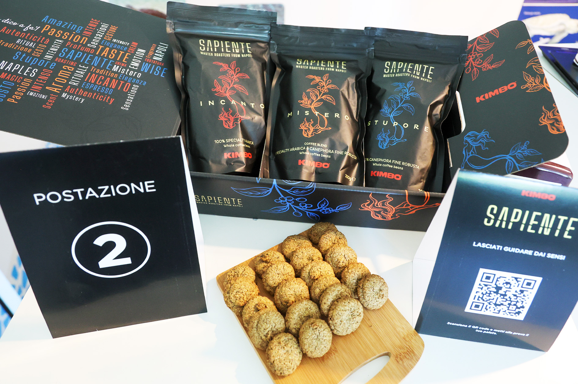
A balance of opposites that becomes a narrative, which we translated into the names of the three blends: Incanto, Mistero, Stupore. These were designed to evoke the emotion of tasting and to convey, through coffee, the authentic soul of the brand.
FROM THE MERMAID TO THE COFFEE PLANT: THE IDEA BEHIND THE PACKAGING
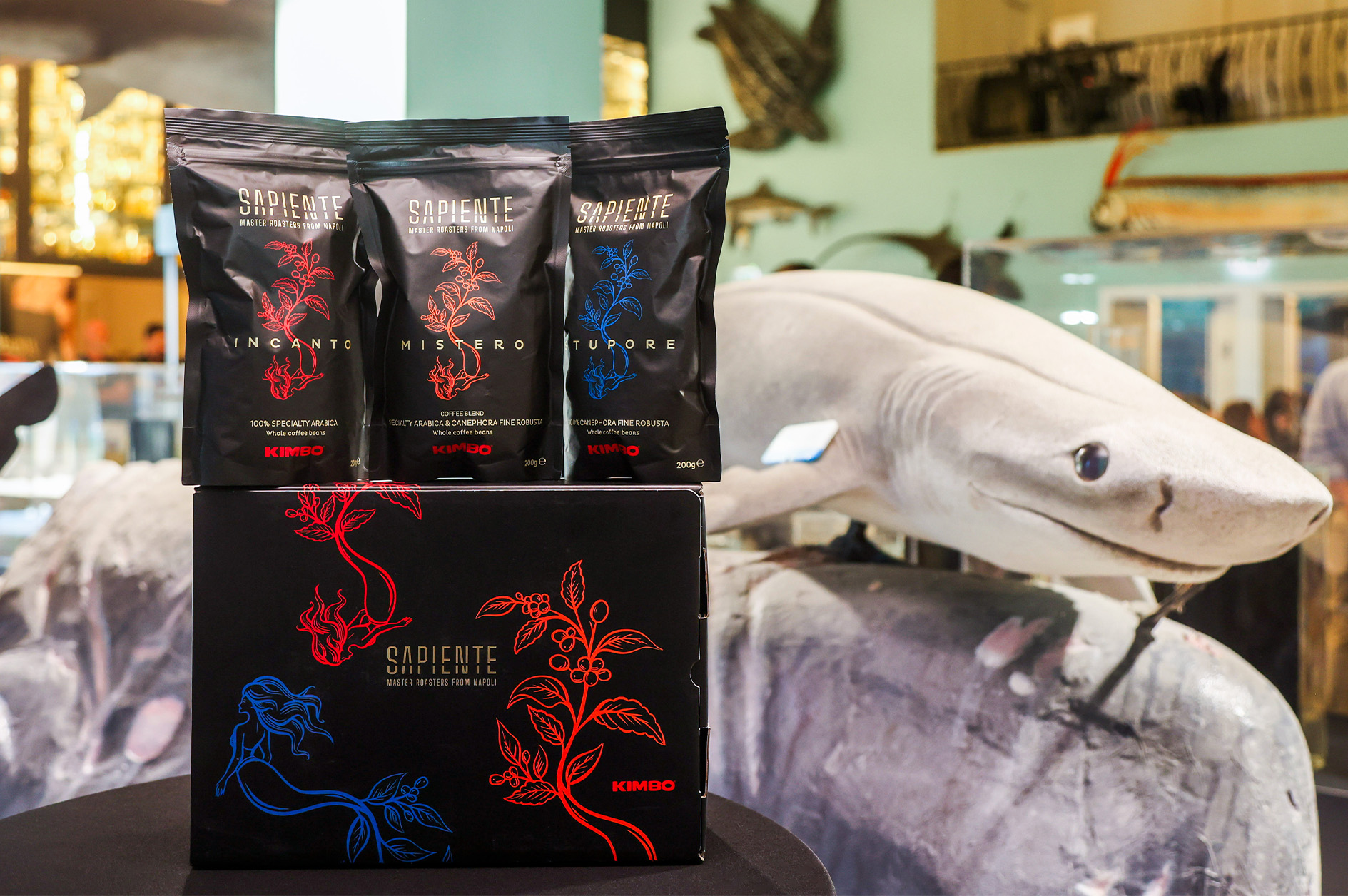
We meticulously crafted the packaging, starting from the creative idea that guided the entire visual development: a surrealist illustration of a siren transforming into a coffee plant.
KIMBO’S ROOTS, FROM THE ELEMENT OF WATER TO THAT OF EARTH
The undisputed protagonist of the packaging is the illustration, created to symbolically and originally tell the essence of Kimbo and its Neapolitan roots.
The mermaid Partenope, emblem of the city, represents the element of water; from her tail springs a coffee plant, embodying the element of earth.
Two central elements—the origin and the cultivation—merge into a single figure that expresses the deep connection between the city, the brand, and the product.
The result is elegant, contemporary, and distinctive packaging, capable of standing out in the market and strengthening the narrative of the Specialty line.

PROJECT OVERVIEW
01
Brief analysis and strategic positioning
By analyzing the client brief and collaborating with the Kimbo team, we understood that the challenge was not just to launch a product, but to give a strong and authoritative identity to the new Specialty line.
02
Naming and storytelling
We crafted the storytelling for the entire project, giving voice to the vision that guided the creation of the line and building a coherent narrative to convey the identity of the range and the character of each blend. We also created the names for the three products, specifically designed to evoke the deepest emotions that only tasting these coffees can inspire.
03
Logo and visual identity
We designed a contemporary and recognizable visual identity, built around the new Sapiente logo, which is both essential and elegant. To reinforce the concept, a surrealist illustration combining the mermaid Partenope and a coffee plant symbolizes the connection between the brand’s origins and those of the raw material.
04
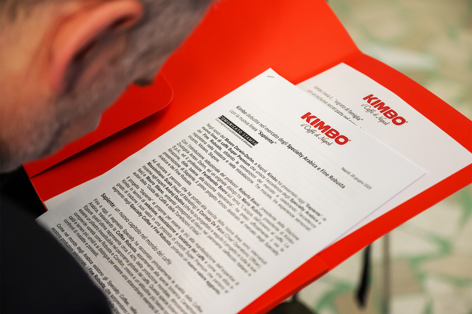
Press Office for the Product Launch
We managed a dedicated press office for the launch event of the line, engaging specialized publications in the coffee sector, Food & Beverage, and HoReCa.